


Samantha Paige is an artist, a mother, a BRCA previvor, a thyroid cancer survivor, and has become an agent of change in her own life and now lives to inspire others to do the same. Last Cut is a multimedia documentary project asking the big questions in life and taking a look at the significant decisions or “last cut moments”.
Task // To create an intimate yet minimalist visual representation of an evolving brand. Although the central message remains the same, the project continues to expand across a wide variety of outlets so it was key to create a consistent visual language that could translate across multiple mediums. Last Cut is a photojournalistic diary, it is a podcast, it is video ad campaign, it is an art show, and it will continue to be so much more.
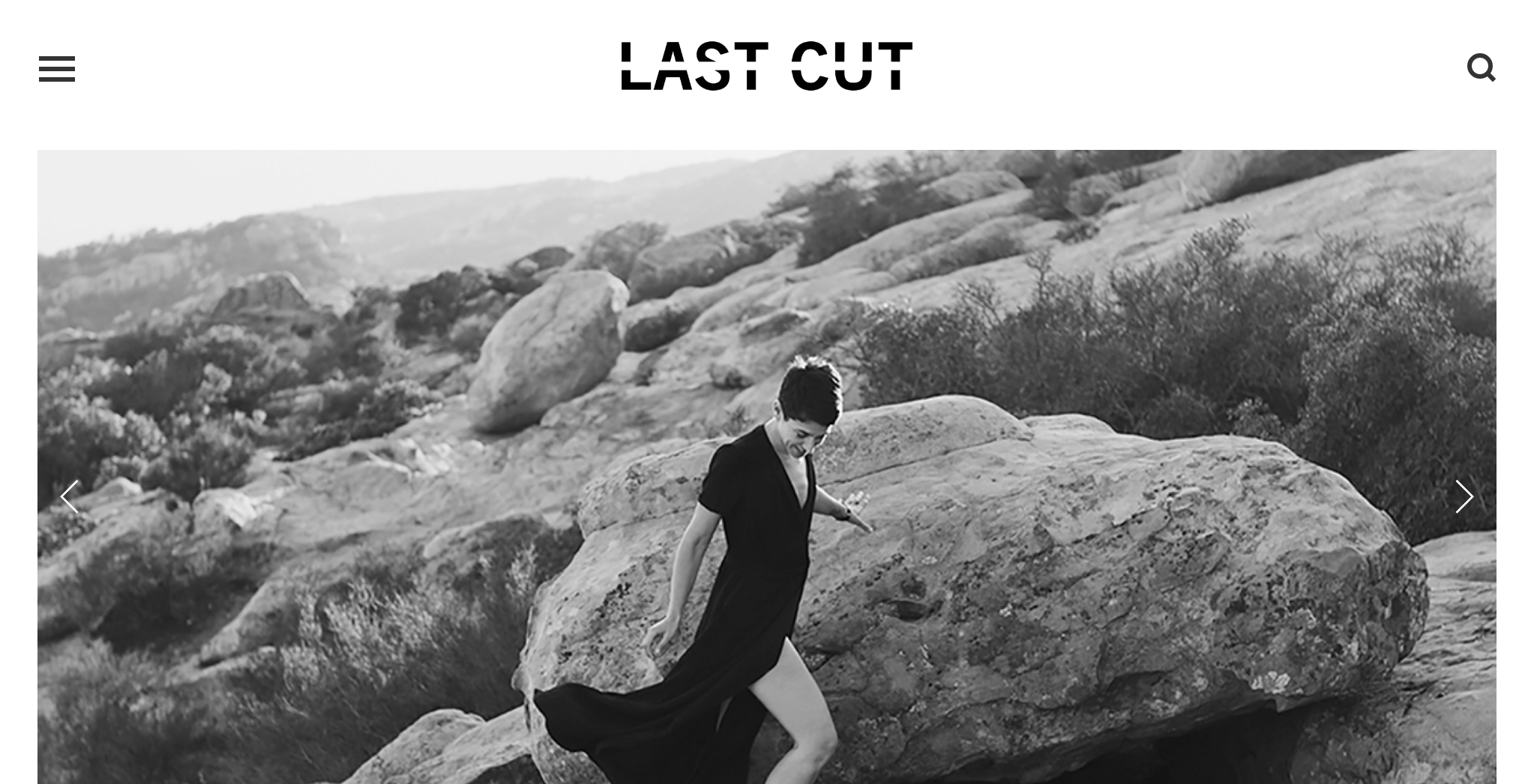
Process // Samantha wanted to feel like browsing through her website was like walking though an art gallery; minimalist, clean, and ethereal. As part of our creative research, we visited a handful of art galleries and museum exhibits to gain perspective on the user experience. When we have an opportunity to create an logo from scratch, we take care of the smallest detail ensuring uniqueness in the result. We also explored the idea of cuts in the literal and the symbolic sense in order to apply that to the creative process. We also looked at subtle nuances that could be applied visually, slight shifts can add a different dimension to the bigger picture.
Final Product // The visual syntax we designed resulted in a bold, simplistic, yet highly refined composition. By employing unique typographic enhancements, we created a cut or a divide across the logotype, allowing the word to communicate visually with versatility. The website is minimalist and consists primarily of impactful black and white photographs of Samantha's documentary.
Scope of work // Brand Identity | Art Direction | Logo Design | Website | Editorial Design